The time has finally come.
After years of hard work, I'm proud to announce the official English release date of Rosenkreuzstilette! Guess what? It's next week!
Don't take my word for it, though. Here's the official trailer:
You can preorder the game from Steam or Playism. I recommend going through Playism; it comes with a free Steam key.
The curtain has risen; who can say what has yet to unfold?

Thursday, January 26, 2017
Tuesday, January 24, 2017
RKS Developer Diary #14 - Background Info

As promised in my last Dev Diary, this will be the final Developer Diary entry devoted to the original Rosenkreuzstilette. A few aspects of the game's localization have changed since I last shone a spotlight on them in earlier entries, whether because of developer / publisher requests or because we were hit with a sudden burst of inspiration (for instance, "Escargot Kame" / "Snail Tortoise" has been officially renamed "Tortoisnail"). I've gone back and updated the text of earlier Developer Diary entries for the sake of consistency, but I've left the original screenshots intact so that you can compare development screenshots with the final release.
Naturally, some of you may want to update the wiki to make sure the information it contains isn't out-of-date.

Since I'm sure many of these tweaks will go unnoticed, I figure I may as well draw attention to some of the changes we made to the stage backgrounds. If you have an old, low-contrast cathode ray tube (CRT) monitor, the color corrections we made to the tilesets of Luste's and Sichte's levels are practically invisible. On the other hand, if you have a more modern display with an adequate level of contrast (an LCD, OLED, TFT, or plasma screen display), the difference is obvious. As usual, click on the images to get a closer look.
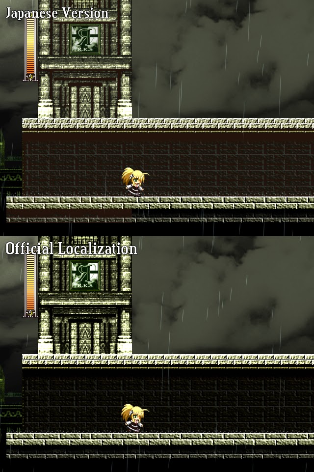
As for the masonry of Zwerberg's clock tower, take a good look at the screenshot to the right. For some reason, the bricks on the left side of the antechamber as well as the rear wall and ceiling are a different color than the rest of the stage. In fact, the entire tileset has a reddish tinge to it that isn't present in any of the background graphics -- something that really stands out when the tiles are placed side-by-side (like the area just below Tia's feet). We addressed the issue in the same manner as we did with Luste's stage, using a color dodge layer to remove the excess red and ensure that the color scheme was consistent.

For our official release, we decided to instead warn players about the contents of the canisters and update the sign to match something you'd find in an actual factory. So, with that kind of setting in mind, the choice was obvious. "Warnung: Hazardous Materials". We doubt that the new sign will prevent newcomers from getting smacked in the face by an overzealous portable suitcase, but at least they'll be able to laugh at themselves when they read the sign and realize what might have been in the tank.
Last, but not least, we have the background of the teleporter room in Iris Stage III. The rear wall sports the mirror image of a sinister message (with some random gibberish thrown in for some reason). In the official English version, we cleaned up the Engrish and formatted the text to give astute players a subtle hint regarding what lay ahead:

Eins, Zwei, Drei...
Rosenkreuzstilette...
God knows
her death
is drawing near...
Hide your fear...
Death
sleeps in
Heaven Hell
Delight Love
Joy Spite
Despair Sorrow
Foresight Anger
Dry her tears
with blood...
You can stop
screaming now...
Rosenkreuzstilette...
God knows
her death
is drawing near...
Hide your fear...
Death
sleeps in
Heaven Hell
Delight Love
Joy Spite
Despair Sorrow
Foresight Anger
Dry her tears
with blood...
You can stop
screaming now...
As you can tell from the screenshots, the text was formatted a bit differently in the original Japanese version. In both versions, the final lines are hidden by the teleporters leading to the Zorne and Sichte homunculi.
Look closely at the positions of each of the emotions in the second paragraph. Where have we seen these words before...? Are they alluding to something...? Hmmm...
Well, that's enough out of me for now. Thank you for following along with the Rosenkreuzstilette Development Diary. The next time we meet, it should be for the debut of the Rosenkreuzstilette Freudenstachel Development Diary. Since the actual game is complete (my only remaining tasks involve the manual and the installer), feel free to request in the comments what you'd like me to explore with you first. Unless it's something I'd consider a spoiler, I'll be happy to oblige.
Oh, one more thing. I'm not sure how accurate this thing is, but if it's spot-on, I'd be very much looking forward to next week if I were you:

Subscribe to:
Posts (Atom)